Page 1 of 1
Opinions on card backgrounds
Posted: 23 Jul 2018, 15:22
by Charlie Brown
While most of the TdM's that are widely available in the US have crisp white backgrounds, others such as the Flornoy and Robledo have a darker cream background. Does anyone have an opinion on the pros and cons of each approach? As I wrote about in another thread, I've been having trouble connecting with my Grimaud and I wonder whether or not that white has something to do with it. My go-to TdM is the Fournier, so it isn't an issue I've had to deal with excessively.
I'm thinking of getting another Marseille deck and I really don't know what to get.
Re: Opinions on card backgrounds
Posted: 23 Jul 2018, 19:03
by CharlotteK
I don't like the Grimaud much either CB. The primary colours seem very harsh next to the black outlines and white backgrounds. I will keep on trying to accept it if not love it on its own terms.
I don't have many TdM decks but the two I like the best so far are Yves' Madenie and the more compact Noblet. Both are of a more creamy complexion.
Re: Opinions on card backgrounds
Posted: 23 Jul 2018, 19:39
by Charlie Brown
I wouldn't say that I don't like it. I like the feel of the cards quite a bit and feel good about the the minors and courts. There's just something about those majors. Maybe you're right that the lines are too heavy. IDK.
I'm thinking maybe a Jodo for the colors, a Noblet for something different (look for a forthcoming post about left-facing death), or a Millennium Edition. The Robledo looks very creamy, so it's kind of a risk for the money, but maybe. I'd get a Hadar if it wasn't for the darn lights shooting out of people's heads. I think I like his pips the best.
Re: Opinions on card backgrounds
Posted: 23 Jul 2018, 20:04
by CharlotteK
I didnt understand what you meant about the lights but then I saw La Papesse

its a nice looking deck though.
Not strictly TdM but there is a Vandeborre Bacchus on eBay. I'm watching it but I think it will go for too much. That looks like a completely crazy deck.
Re: Opinions on card backgrounds
Posted: 23 Jul 2018, 22:38
by Charlie Brown
CharlotteK wrote: ↑23 Jul 2018, 20:04
I didnt understand what you meant about the lights but then I saw La Papesse
I think some of the courts have that effect too. The pips just transport me, though.
Re: Opinions on card backgrounds
Posted: 24 Jul 2018, 09:12
by stronglove
CharlotteK wrote: ↑23 Jul 2018, 20:04
I didnt understand what you meant about the lights but then I saw La Papesse
its a nice looking deck though.
Not strictly TdM but there is a Vandeborre Bacchus on eBay. I'm watching it but I think it will go for too much. That looks like a completely crazy deck.
i bought my vandenborre at game of hope lenormand, i like it very much
http://gameofhopelenormand.bigcartel.co ... n-etteilla
Re: Opinions on card backgrounds
Posted: 24 Jul 2018, 09:27
by stronglove
my dodal is more white, but rather matte, so not crisp clean white, and the black outlines are not very heavy. i like it a lot.only problem is the size of the cards. i bought the jodorowsky because i was reading his book, but the bright colors and the white background don’t really appeal to me.
for reading i think i will prefer the perrin or vergnano, or the vandenborre, maybe the noblet.
Re: Opinions on card backgrounds
Posted: 24 Jul 2018, 10:38
by CharlotteK
I've bid on the Bacchus. If I win I win, if I don't, it was too expensive. There are 5 days left on the auction so will resist having a look until it is over! The cost of the deck and shipping to UK from the game of hope site is a bit too much for me right now.
Nothing quite like the originals (sort of)
Posted: 24 Jul 2018, 13:12
by Tag Jorrit
Admittedly I am not impartial. I like a facsimile reproduction rather than a re-drawn restoration, that I can riffle shuffle and that has the images of the actual antique cards without the stark white background and primary colors. So I reproduced the
Dodal with its original colors, slightly cleaned up, with the original aged background and modern card stock that feels wonderful in hand. Nothing beats the subtleties of the expressions on the originals. JMHO

Re: Nothing quite like the originals (sort of)
Posted: 24 Jul 2018, 15:49
by Charlie Brown
Tag Jorrit wrote: ↑24 Jul 2018, 13:12
Admittedly I am not impartial. I like a facsimile reproduction rather than a re-drawn restoration, that I can riffle shuffle and that has the images of the actual antique cards without the stark white background and primary colors. So I reproduced the
Dodal with its original colors, slightly cleaned up, with the original aged background and modern card stock that feels wonderful in hand. Nothing beats the subtleties of the expressions on the originals. JMHO
Those are awfully nice. Are you the person who runs Old Lenormand Cards? I haven't had the pleasure of one of your decks yet but they're wonderful.
Re: Opinions on card backgrounds
Posted: 24 Jul 2018, 15:52
by Charlie Brown
stronglove wrote: ↑24 Jul 2018, 09:12
i bought my vandenborre at game of hope lenormand, i like it very much
I wasn't previously familiar with the Vandenborre. I see that The Hanged Man has those same things on this shoulders as in the Noblet. Does anyone know if they are meant to be his hands or wings or what?
Re: Opinions on card backgrounds
Posted: 24 Jul 2018, 17:44
by Tag Jorrit
Charlie Brown wrote: ↑24 Jul 2018, 15:52
I wasn't previously familiar with the Vandenborre. I see that The Hanged Man has those same things on this shoulders as in the Noblet. Does anyone know if they are meant to be his hands or wings or what?
Fingers. Don't they look silly? I like that Hanged Man a lot.
Re: Nothing quite like the originals (sort of)
Posted: 24 Jul 2018, 17:45
by Tag Jorrit
Charlie Brown wrote: ↑24 Jul 2018, 15:49
Those are awfully nice. Are you the person who runs Old Lenormand Cards? I haven't had the pleasure of one of your decks yet but they're wonderful.
Thank you, and, guilty.
Re: Nothing quite like the originals (sort of)
Posted: 26 Jul 2018, 22:30
by stronglove
Tag Jorrit wrote: ↑24 Jul 2018, 17:45
Charlie Brown wrote: ↑24 Jul 2018, 15:49
Those are awfully nice. Are you the person who runs Old Lenormand Cards? I haven't had the pleasure of one of your decks yet but they're wonderful.
Thank you, and, guilty.
OMG, you are game if hope lebormand as well..... didn’t know your etsy shop. i am so awed by your work, i think your decks are beautiful! i have 3 of them and really love them! i started with the lismon etteilla (i am a bit etteilla obsessed, have 4 versions of his deck....) then later got the vandenborre and the dr papus. very nice cardstock too! i think the lismon etteilla is my favorite version, with the subdued soft colors, you did a wonderful job on that one. great to meet you here!
Re: Opinions on card backgrounds
Posted: 27 Jul 2018, 15:23
by Tag Jorrit
Thanks for your support, Stronglove. I like the Lismon best, too. I think it's the lovely blue frame around the images. Yeah, that's it. And the soft colors.
Lenormand became my obsession, and what started my card making. Now I am dabbling in TdM but there are a few lovely collector-oriented decks that are being made. Like them a lot but still prefer ones I can SHUFFLE and not just look at.
The GoH store I passed along to my daughter last year but discovered I couldn't stay away so I opened the Etsy store. I also have another on the big cartel,
The Cartomancer with a couple of decks that are not on the GoH website. Including a new one that's in the works that's neither tarot nor Lenormand. No, not obsessed at all. Nah, not me.
Re: Opinions on card backgrounds
Posted: 28 Jul 2018, 19:10
by stronglove
wow, thanks for the link, that minchiate is fascinating! i have the fiorentine etruria and the fiorentine al leone, both with the 97 cards but this one looks completely different! such a pity my wallet is empty..... have put it on my wishlist!
Re: Opinions on card backgrounds
Posted: 18 Aug 2018, 07:17
by BreathingSince72
Charlie Brown wrote: ↑23 Jul 2018, 19:39
I wouldn't say that I don't like it. I like the feel of the cards quite a bit and feel good about the the minors and courts. There's just something about those majors. Maybe you're right that the lines are too heavy. IDK.
I'm thinking maybe a Jodo for the colors, a Noblet for something different (look for a forthcoming post about left-facing death), or a Millennium Edition. The Robledo looks
very creamy, so it's kind of a risk for the money, but maybe. I'd get a Hadar if it wasn't for the darn lights shooting out of people's heads. I think I like his pips the best.
 Viewed 2902 times")
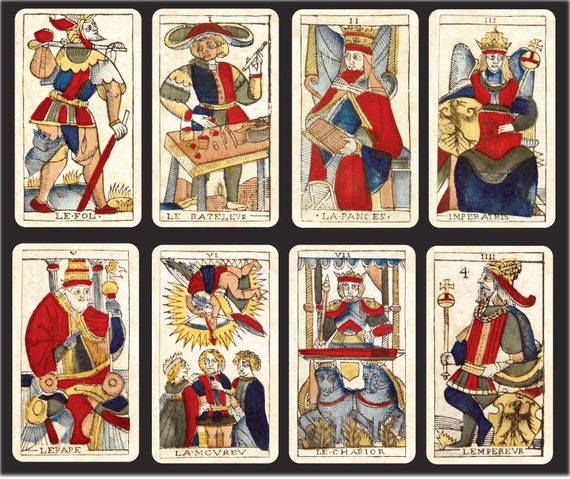
Charlie Brown, in case you’re interested and it helps you to choose a new deck, the are to left to right: the Jean Dodal by Flornoy; the CBD by Yoav Ben-doc; the Jean Noblet by Flornoy; the Pierre Madenié by Yves Reynaud and bottom...the Vandenborre Bacchus by Pablo Robledo. I am considering getting the Dodal by Pablo Robledo. His card stock makes me smile inside. It is not, however, laminated. The work by Reynaud and Flornoy is also wonderful...durable card stock and, I think, a little more water resistant. I was told that the Vandenborre by Robledo pretty rare but I managed to ask the right question on the right site and got a deck from his most recent run. I’m happy to post other card pics if you like. I love this stuff.
Re: Opinions on card backgrounds
Posted: 18 Aug 2018, 07:22
by Charlie Brown
Thanks, Victoria.
I ended up getting a Burdel by Yves from a shop in New York. I wasn't going to do it, but it was #9 in the edition, which = Hermit, which is my card. So I thought it was calling out to me. I'm super glad that I did. The deck is amazing. I didn't think I was going to like a reproduction deck, but the softness of the lines and colors just really helps the bigger picture reveal itself.
Maybe one day if I develop enough of a minors-only practice I'll get myself that Hadar.
I might might might get the Noblet only because it's small, which would be better for tableau. I did a 12-card circle a couple of weeks ago and even that was starting to take up a fair bit of space.
Re: Opinions on card backgrounds
Posted: 18 Aug 2018, 12:17
by CharlotteK
Charlie Brown wrote: ↑18 Aug 2018, 07:22
Thanks, Victoria.
I ended up getting a Burdel by Yves from a shop in New York. I wasn't going to do it, but it was #9 in the edition, which = Hermit, which is my card. So I thought it was calling out to me. I'm super glad that I did. The deck is amazing. I didn't think I was going to like a reproduction deck, but the softness of the lines and colors just really helps the bigger picture reveal itself.
Maybe one day if I develop enough of a minors-only practice I'll get myself that Hadar.
I
might might might get the Noblet only because it's small, which would be better for tableau. I did a 12-card circle a couple of weeks ago and even that was starting to take up a fair bit of space.
Oh lovely. I have Yves' Burdel on order. And the Noblet is a wonderful deck too. I love the smaller size.
Re: Opinions on card backgrounds
Posted: 19 Aug 2018, 06:38
by Flaxen
Charlie Brown wrote: ↑24 Jul 2018, 15:52
I wasn't previously familiar with the Vandenborre. I see that The Hanged Man has those same things on this shoulders as in the Noblet. Does anyone know if they are meant to be his hands or wings or what?
There was a theory that they are definitely fingers but ones which had been broken through torture. When the one meaning of the card was ‘Traitor’ it’s not inconceivable.
 its a nice looking deck though.